A gaming thumbnail gets clicks when one idea reads instantly at 120 pixels wide, the image breaks the visual pattern of the feed it lands in, and a concrete stake like a number, a day count or a rank is visible. You do not need Photoshop or a paid designer to hit that. You need one promise, one hero frame, and a two-minute check before you upload.
Gaming is the toughest feed on YouTube to blend into by accident. Viewers scroll past dozens of Minecraft builds, Warzone clips and survival runs in a single sitting, so a thumbnail that would win in cooking looks invisible here. That is why gaming thumbnails get their own rules, and why the same video with a stronger thumbnail can jump from a few hundred views to a few thousand.
This guide walks through the whole process: what to gather, the seven steps from promise to export, the specs to export at, the color logic for each game genre, and the checks to run before you hit publish. It should take about 20 minutes to read and about 30 to 45 to apply to your next upload.
Table of Contents
- What You Need
- Step-by-Step: How to Make a Gaming Thumbnail That Gets Clicks
- 1. Choose One Clear Video Promise
- 2. Capture a High-Contrast Hero Moment
- 3. Build a Strong Visual Hierarchy
- 4. Add Text That Remains Readable
- 5. Use Color and Emotion to Signal the Topic
- 6. Compose and Export for Each Platform
- 7. Test the Thumbnail Before Publishing
- Gaming Thumbnail Specs: What to Export
- Face vs Gameplay Screenshot: Which One Wins in Gaming?
- Color and Contrast by Game Genre
- How to Make a Raw Game Screenshot Look Made
- Cut out the subject
- Relight to match
- Grade the whole frame
- Add one graphic element the game would never ship
- The Pre-Upload Checklist
- A/B Testing Gaming Thumbnails After Publishing
- Common Mistakes
- Too much text, or text that repeats the title
- Tiny details that only exist at full size
- A weak focal point
- Misleading imagery
- Raw screenshots pasted on a flat background
- Thin dark edges in dark mode
- Inconsistent series branding
- Over-editing, and the dated red-arrow formula
- Spending effort at the wrong subscriber count
- Frequently Asked Questions
- What software should I use to make a gaming thumbnail?
- How much text should I put on a gaming thumbnail?
- Should I use my face or a game character in a thumbnail?
- How do I know if a gaming thumbnail is too complicated?
- Can I A/B test thumbnails after publishing a video?
- What size and format should a gaming thumbnail use?
- Conclusion
What You Need
Almost everything you need is free or already on your machine. Gather these five things before you open any software, because the hardest part of thumbnail work happens before the design starts, in the frame you choose and the promise you commit to.
- A recent gameplay capture. Pull the frame from the actual video, not from memory. The frame that carries the moment is usually not the frame you remember.
- A character or creator image. Either a cutout of the character in-game or a photo of your own face with a real expression. Not both at full size.
- Editing software. Photopea or Canva Free is enough for most channels, CapCut works well for quick composites, and Photoshop or Affinity Photo once you want real masking and relighting.
- A condensed bold font. Anton, Bebas Neue, Montserrat ExtraBold or Impact all survive the small-size test. Avoid anything with thin strokes or script shapes.
- A one-line brief. Write the single sentence the thumbnail is selling before you design anything. If you cannot write it in seven words or fewer, the video does not have one clear promise yet.
Two more things help more than any extra plugin. A phone, or any window you can shrink the image in, so you can run the small-size test properly. And a screenshot of the browse feed you are aiming at, because your thumbnail competes with that feed and nothing else.
Step-by-Step: How to Make a Gaming Thumbnail That Gets Clicks
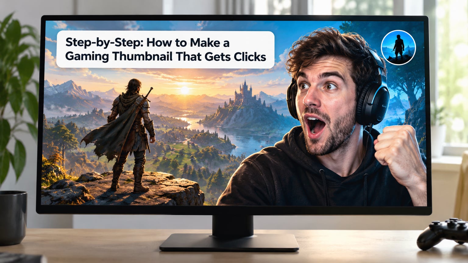
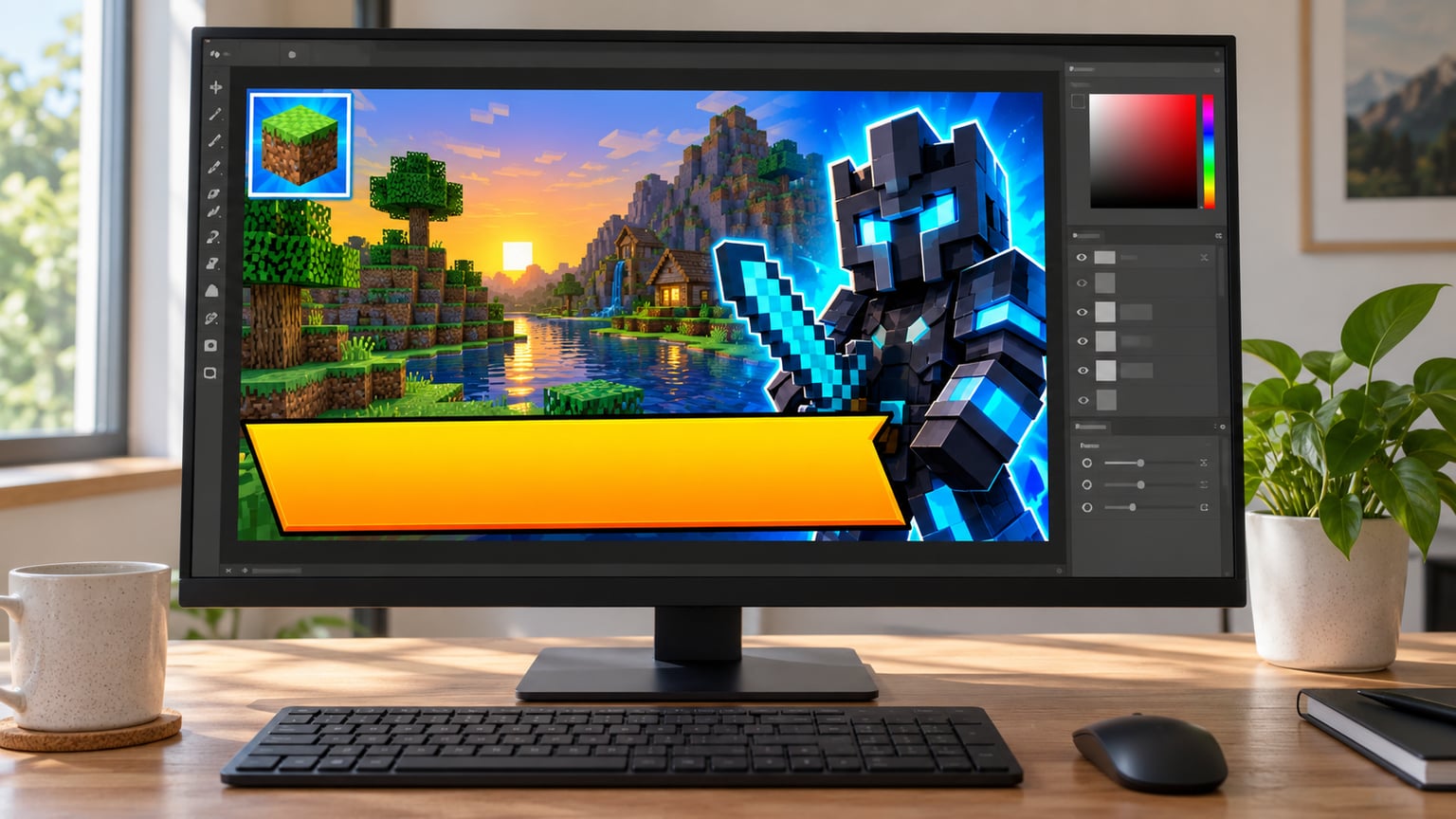
The workflow below is deliberately boring in the best way. Each step has a check that tells you whether it worked, so you can stop guessing about why a video flopped and start changing one variable at a time.
1. Choose One Clear Video Promise
Write the one thing the viewer gets. Not everything the video contains, just the single payoff. A video about surviving 30 days in a hardcore survival world has one promise: can you make it 30 days. Everything else in the thumbnail should point at that.
The check: if two unrelated claims are fighting for space, you have two videos, not one thumbnail. A creator in r/NewTubers described the habit that works, picking the funniest or most surprising moment in the footage first and building both the title and the thumbnail around it rather than designing after upload.
2. Capture a High-Contrast Hero Moment
Scrub the video for the frame with the clearest subject and the most readable action. You want a character you can identify instantly, an action you can name in one word, and a background that supports rather than competes.
Contrast here is about the frame itself, not the file settings. A dark corridor shot for a horror video is fine as long as the character is the brightest thing in it. A bright desert scene with the character lost in the middle is not. The check: cover the bottom third of the frame and see if the subject still reads. If it does not, the frame is too busy.
3. Build a Strong Visual Hierarchy
Decide what the viewer sees first, second and third, and make that order obvious through size, brightness and position. The first element is usually the character or the face. The second is the text. The third is a supporting cue, like an item being held, a number, or a small inset showing the game.
Three elements is a working limit, not a law, but it is a good default. Gaming creators in the forums keep landing on the same fix when their thumbnails feel wrong: take something out. One r/letsplay poster described simplifying until the result was straightforward enough that a single glance told you the subject.
The check: if everything is important, nothing is. Give your top element roughly twice the visual weight of the second and see how the frame changes.
4. Add Text That Remains Readable
Keep it to three to five words, all caps, in a bold condensed sans, and give every letter a stroke so it survives a bright or a dark background. One accent color, not a rainbow. If the words are only decoration, take them out.
Size matters more than font choice. At a 1280 by 720 canvas, the main text should be large enough that it is a headline, not a caption. Work out the size by the small-size test rather than by eye on a monitor, because designers routinely build at full size and only discover on a phone that the overlay is unreadable.
The check: shrink the canvas to about 120 pixels wide. If the words are not instantly readable, they are too small, too many, or both.
5. Use Color and Emotion to Signal the Topic
Color is doing two jobs at once, signaling mood and separating you from the feed. Pick a palette that matches the genre, then push one element brighter or more saturated than everything around it. One bright element in a dark frame is a spotlight. Five bright elements are noise.
Emotion is the part people overthink. You do not need a stock wide-eyed open-mouth face; that expression is now so common in gaming it disappears into the background. A real expression, a tilted head, a hand mid-gesture, or a face caught mid-laugh reads as a person and stands out more than the recycled shock face.
The check: turn off the sound and ask someone who has not seen your video what mood the thumbnail suggests. If the answer is a different mood from the video, the color is lying.
6. Compose and Export for Each Platform
Build once at 16:9 and place the key elements inside the safe area, because platforms overlay their own interface on top of your image. On YouTube, the progress bar and the duration badge sit along the bottom, and the bottom right corner gets covered when the video is hovered. Keep text and faces clear of the bottom edge and the lower right corner.
For YouTube, export 1280 by 720 at 16:9. Twitch behaves differently: the site crops to a more square-ish shape in several placements, so keep the focal point in the center rather than hugging the edges. For Shorts and any vertical placement, produce a separate 1080 by 1920 version with the subject in the vertical middle third rather than trying to reuse the widescreen frame.
Export in sRGB and keep the file under the platform limit, which for YouTube thumbnails is about 2MB. JPG at a high quality setting is fine for a photographic gameplay frame, PNG if you need clean edges around a cutout or sharp text. Save your working file at full resolution as a PNG so you can re-export for different placements without quality loss.
7. Test the Thumbnail Before Publishing
Run four checks, in this order. Shrink test: resize to 120 pixels wide and confirm the premise reads. Feed test: drop the image into a screenshot of the real browse feed for your game and check it against its actual neighbors. Dark mode test: view it on a dark background, because most gaming viewers browse at night. Word test: read the text out loud and count the words.
If the premise does not read at 120 pixels, the fix is almost never a bigger font. It is usually a second idea that needs to go. Community advice across the creator forums lands on this zoom-out test more than any other rule, and it is the single fastest diagnostic you have when clicks are low.
The check for all four: you should be able to state the video’s promise after a two-second look, before reading a single word of the title.
Gaming Thumbnail Specs: What to Export
These are the numbers that answer most of the size questions, and they have not needed to change in years. Get them right and the rest of the design work shows up properly on every device.
| Setting | Value | Why it matters |
|---|---|---|
| Width x height | 1280 x 720 px | Minimum recommended for a full-resolution YouTube thumbnail |
| Aspect ratio | 16:9 | Matches the video player, so no letterboxing on desktop |
| Maximum file size | About 2MB | YouTube rejects much larger uploads |
| Format | JPG for frames, PNG for cutouts | JPG keeps file size down, PNG keeps edges and text crisp |
| Color profile | sRGB | Matches how the image is displayed on most screens |
| Safe zone | Keep clear of the bottom edge and lower right | Progress bar and duration badge cover that area |
| Readability test size | About 120 px wide | Approximates the mobile feed preview |
| Vertical variant | 1080 x 1920 px | For Shorts and vertical feed placements |
Is the thumbnail 4:3 or 16:9? It is 16:9. Older 4:3 files get accepted but display with bars or a crop, and the cropped edges are usually where the text was.
Face vs Gameplay Screenshot: Which One Wins in Gaming?
Use your face when your channel sells you, and use a composite gameplay frame when your channel sells the game. That single question resolves most of the debate, because it tells you what the viewer is being promised before the video starts.
Faceless gaming channels, lore channels, build channels and game review channels usually win with a strong gameplay composition. Personality channels, challenge runs and story-driven Let’s Plays usually win with a face, because the promise is about who is doing something rather than about the world being shown.
| Factor | Face-led thumbnail | Gameplay-led thumbnail |
|---|---|---|
| Best for | Challenge runs, story episodes, personality channels | Builds, lore, reviews, faceless channels |
| Ceiling | Higher, because a recognizable creator builds loyalty | Lower per click, but scales with the topic |
| Risk | Reads as generic if the expression is a stock reaction | Reads as an unedited screenshot if nothing is composited |
| Series consistency | Face plus a locked text treatment | A locked crop and color grade across episodes |
| Small-size test | Eyes must be large enough to read the emotion at 120 px | Subject must occupy roughly a third of the frame |
A middle option works well for both: a large gameplay frame with a small face inset in one corner. The game gets the frame, the creator gets a signal, and the corner inset survives the feed because it echoes how people already read that content.
Color and Contrast by Game Genre
Contrast is relative. A thumbnail only needs to beat the feed it appears in, and each gaming feed has a different average color. This is the part most guides skip, and it is the fastest win available to a small channel.
| Genre or feed | What the feed looks like | What to use to pop |
|---|---|---|
| Minecraft and survival crafting | Green, blocky, bright skies | Warm skin tones, saturated reds, a dark vignette behind the subject |
| FPS and battle royale | Grey and orange, HUD-heavy, low saturation | Clean flat color blocks and one neon accent; keep UI clutter out of the crop |
| Horror | Very dark, mostly black frames | One bright element only, a pale face or a lit doorway; everything else stays near black |
| Sandbox and open world | Wide skies, mid-tone landscapes | A strong foreground silhouette and a saturated sky gradient behind it |
| Esports and analysis | Broadcast-clean, team colors, dark overlays | Arrow-free clean framing, a stat block or a face-cam crop, team color as the accent |
| Racing | Motion blur, bright tarmac, high contrast | Diagonal lines, a car isolated on a flat background, speed streaks used once |
The rule behind the table is simple: take the average color of the feed, then move away from it. A dark horror feed rewards the opposite of dark, and a bright Minecraft feed rewards the opposite of bright.
How to Make a Raw Game Screenshot Look Made
This is the skill gap on this whole topic. Almost every guide says composite your screenshot, and almost none explain how. If your thumbnails are getting impressions but no clicks, this is usually the reason: they look captured, so they look like every other raw grab in the feed.
Cut out the subject
Select the character, vehicle or item and remove the background. Mask the edges carefully around hair, helmets and grass, because a halo of leftover background is the fastest way to look amateur. Add a two to four pixel outline in a dark color or a light color depending on what sits behind, and the cutout stops looking like a sticker.
Relight to match
Game engines light characters in ways that rarely match a new background. Duplicate the subject layer, flatten it slightly with curves or a levels adjustment, and nudge brightness and contrast until the character sits in the same light as the scene behind them. Drop a soft shadow under the subject so it sits on the background rather than floating over it.
Grade the whole frame
Put the cutout and the background under one color grade. Match saturation and temperature across both, then add a gentle vignette to push attention to the center. This one step is the difference between a paste-up and a designed image, and it takes about a minute.
Add one graphic element the game would never ship
A subtle glow behind the subject, a particle burst, a cracked-screen overlay, a light sweep across the text. Pick one and use it at low opacity. The goal is to add production value, not decoration, and two effects fighting each other will undo the whole job.
The check: compare the finished frame against the raw screenshot side by side. If you cannot tell which was edited, the composite has not gone far enough.
The Pre-Upload Checklist
Run this list every time. It takes about two minutes and it catches the problems that account for most low click-through rate on gaming channels.
- Shrink the canvas to 120 pixels wide and confirm the premise still reads.
- Drop it into a screenshot of the real browse feed for your game and check it against its neighbors.
- View it on a dark background, since most gaming viewers browse at night.
- Count the words. Three to five, or remove the text.
- Check the one-idea rule: is there a single focal point, or does everything shout?
- Check the title pairing: do the thumbnail and title tell the same story without repeating each other word for word?
- Confirm the bottom edge and lower right corner are clear for the progress bar and duration badge.
- Confirm the file is 1280 by 720, 16:9, sRGB, and under about 2MB.
- Open it on an actual phone, not just a shrunk canvas.
- Ask someone outside your channel to describe it in three words. If their answer is not the promise, start at step one.
Items 1, 2 and 3 catch most failures. Everything else is a refinement on top of them.
A/B Testing Gaming Thumbnails After Publishing
You can test a thumbnail after a video is live. YouTube Studio offers Test and Compare for eligible videos, and the useful part is that it measures the thing you actually care about rather than your own opinion.
Build three variants, not two, and change exactly one variable across them. If variant B changes the text and the color and the crop, a win tells you nothing about what caused it. Swap the emotional face for variant B, the text for variant C, and hold everything else fixed.
Let each variant run long enough to mean something. Think in terms of impressions rather than hours, because a channel with a small audience can burn a day and learn nothing. A few hundred impressions per variant is a reasonable floor before you read anything into the numbers.
Judge on click-through rate and average view duration together, never on click-through rate alone. A thumbnail that lifts clicks and drops watch time is telling you the video did not deliver, and YouTube will respond by showing it to fewer people. That is the real cost of clickbait, and it shows up as reduced recommendation reach over weeks rather than as a warning on the video itself.
If changing the thumbnail makes a difference, the fix is usually obvious. If it does not, your impressions are too low for the test to read, and the problem is upstream in topic selection rather than in design.
Common Mistakes
These are the errors that come up again and again in creator forums, and each one has a specific fix.
Too much text, or text that repeats the title
Long overlay text competes with itself and with the title. Cut to three or five words, and let the title carry the nuance. A thumbnail saying IMPOSSIBLE above a video titled “I Tried The Hardest World Difficulty In Minecraft” is two halves of one idea, which is the pattern you want.
Tiny details that only exist at full size
Inventories, HUD fragments, small lore items and background jokes vanish at 120 pixels. If a viewer has to zoom in to get it, the design has already failed for the feed. The r/IndianGaming advice is the most useful kind you will find on this topic: make the text a little bigger and change the stroke color from black to white.
A weak focal point
Two equally large elements mean no focal point. Scale one up, or crop tighter until the subject takes up about a third of the frame. A character occupying ten percent of the canvas is a detail, not a subject.
Misleading imagery
Showing a result the video never delivers buys one click and costs retention. The fix is not to be boring; it is to show the stake and withhold the outcome. Show the impossible build existing, not the finished result being collected. Curiosity works because the gap is real.
Raw screenshots pasted on a flat background
It reads as low effort, especially in Minecraft and survival feeds where everyone does it. Cut out, relight, grade, add one graphic. Even fifteen minutes of compositing makes a measurable difference.
Thin dark edges in dark mode
Dark keys, thin outlines and low-contrast gray text disappear against a dark interface. Give text a contrasting stroke, and never rely on a soft shadow alone to separate an element from the background.
Inconsistent series branding
Let’s Play viewers recognize a series by its treatment. Lock one layout, one font and one color, then change exactly one element per episode, usually the variable text or the hero frame. Repainting the entire style each week resets recognition instead of building it.
Over-editing, and the dated red-arrow formula
Every effect at once is its own failure mode: too much glow, too much grading, three graphic elements, a face, an arrow, a circle and a logo. The old red arrow and yellow text formula is not banned, and it still works for a big moment on a small channel. It reads as dated when three other channels in the same feed use the same arrow, the same yellow and the same layout in the same week. Copying the pattern that worked in a feed where nobody else uses it is fine; copying it into a feed where everyone does is invisible.
AI generators default to exactly that look, which is why their output blends in. Use them for ideas and backgrounds, and build the final frame yourself.
Spending effort at the wrong subscriber count
Below roughly a thousand subscribers, ideas and retention usually matter more than thumbnail craft. Watch time is what the recommendation system needs first, and a brilliant thumbnail on a video nobody finishes will not carry the channel. Get the fundamentals working, then invest in design.
Frequently Asked Questions
What software should I use to make a gaming thumbnail?
Photopea and Canva Free cover most gaming thumbnail work at no cost, and CapCut is quick for a rough composite. Photoshop or Affinity Photo earn their place once you are masking characters, relighting layers and grading color. Whichever you use matters less than repeating one workflow, because a consistent look across episodes is what makes a series recognizable in the feed.
How much text should I put on a gaming thumbnail?
Three to five words, all caps, in a bold condensed sans with a contrasting stroke. Long overlay text competes with itself and with the title, and every extra word has to be readable at roughly 120 pixels wide. The text should add something the title cannot say in that moment, usually a stake like a day count, a rank or a number.
Should I use my face or a game character in a thumbnail?
Use your face when your channel sells you, and a composite gameplay frame when it sells the game. Personality channels, challenge runs and story episodes tend to win with a face, while builds, lore and faceless reviews win with strong gameplay. A small face inset over a large gameplay frame is a reasonable middle ground that works for both.
How do I know if a gaming thumbnail is too complicated?
Shrink it to about 120 pixels wide. If the premise does not read instantly, it is too complicated, and the fix is rarely a bigger font. Count your elements, and if you cannot name the first, second and third thing a viewer sees, there are too many. Then paste it into a screenshot of the real browse feed and check it against its actual neighbors.
Can I A/B test thumbnails after publishing a video?
Yes, eligible videos can use Test and Compare in YouTube Studio after publishing. Build three variants and change only one variable across them, so a win tells you which change caused it. Let each variant accumulate a few hundred impressions before reading anything into the numbers, and judge click-through rate together with average view duration.
What size and format should a gaming thumbnail use?
Export 1280 by 720 pixels at a 16:9 aspect ratio in sRGB, and keep the file under roughly 2MB. Use JPG for a gameplay frame and PNG when you need clean cutout edges or sharp text. Keep the bottom edge and the lower right corner clear, since the progress bar and duration badge cover that area on YouTube.
Conclusion
The whole process reduces to three things: one readable promise, one hero frame that contrasts with its feed, and one concrete stake. Get those right and the rest is craft.
Start with your next upload rather than your back catalog. Write the one-sentence promise, scrub the footage for the frame that best shows it, and cut that subject out so the image looks made rather than captured. Then shrink it to 120 pixels, paste it into a screenshot of the real browse feed, and check it on a dark background before you publish. Those three checks catch most of what holds a gaming thumbnail back.