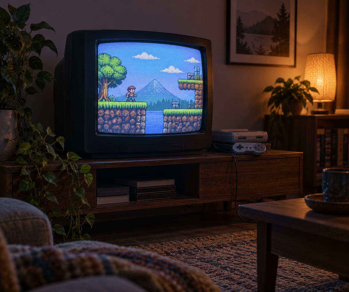
CRT displays affected old game design because developers treated the tube in the corner of the dev room as part of the art pipeline. Low vertical resolution, tiny palettes, no alpha channel and an electron beam that blended neighbouring pixels made sprites larger, colours bolder and gradients faked with dithering patterns.
Nearly every game built before the mid-2000s was drawn, tuned and signed off on a CRT. That is the whole reason so much classic pixel art looks correct on a tube and unfinished on a flat panel.
Table of Contents
- Why Early Games Were Designed Around CRT Displays
- How CRT Displays Shaped Old Game Design
- How Low Resolution Encouraged Simple, Readable Graphics
- How Scanlines and Bloom Influenced Pixel Art
- Why Limited Color Led to Careful Palette Design
- How Refresh Rate and Input Lag Affected Gameplay
- What CRT Constraints Mean for Camera and Level Design
- Examples of CRT Influence on Classic Games
- Did CRTs Make Old Games Better?
- How to Judge CRT Accuracy on a Modern Display
- Frequently Asked Questions
- Why do some classic games look different on a CRT?
- Did developers actually draw sprites for scanlines?
- Are arcade monitors better than consumer TVs for old games?
- Does using a CRT improve input lag?
- Is scanline emulation the same as authentic CRT image quality?
- Were old games designed to look better without a CRT?
- Conclusion
Why Early Games Were Designed Around CRT Displays
A CRT monitor is an analogue display. It draws the picture by firing an electron beam across the screen one horizontal line at a time, top to bottom, and lighting red, green and blue phosphor dots as it goes. That process is called raster scanning, and the small gaps between the bright bands of light become the scanlines you see on a real tube.
Because there is no fixed pixel grid in the way an LCD panel has one, a CRT can display almost any signal its beam can resolve. A console could output 256 pixels across, or 320, or 384, and the beam would fill whatever width it was given. The image had soft edges, glowing highlights and colour that bled slightly sideways. Developers leaned into all of it.
Three things followed from that setup. First, resolution budgets were spent carefully, because every pixel cost memory and clock cycles. Second, the display did visual work for free, smoothing over blocky edges and hiding palette banding. Third, timing was predictable, because the beam refreshed on a fixed schedule the hardware and the artists both knew.
That is the answer to the direct question. How CRT displays affected old game design is easiest to see in the gap between what a developer could draw and what the tube made readable. Everything below follows from that gap.
How CRT Displays Shaped Old Game Design
Each property of a CRT imposed a constraint and pushed developers toward a specific workaround. The table below maps the physical behaviour of the tube to what it looked like on screen and what people building games did about it.
| CRT behaviour | What you saw | What developers did about it |
|---|---|---|
| Low vertical resolution (240p, 320×200 internal) | Chunky pixels that could not hold fine detail | Large sprites, bold silhouettes, uncluttered playfields, tile-based backgrounds |
| Dark gaps between scanlines | Visible horizontal lines and softened pixel corners | Art drawn to be read through the gaps, with implied detail rather than literal detail |
| Phosphor glow and colour bleed | Bloom around bright pixels, slight colour smearing | Fake transparency, mesh patterns, gradients that do not exist in the palette |
| Small hardware palettes (NES, SNES, arcade boards) | Roughly 4 to 256 colours per frame | Deliberate palettes, colour-coded hazards, exaggerated contrast between regions |
| Instantaneous phosphor response | Almost no input lag, no ghosting | Tighter hitboxes, faster animation tells, competitive mechanics tuned for raw response |
| Curved glass and overscan | Bowed edges, corners pushed off screen | Important art kept near the centre, HUD elements sized for a safe area |
| Interlaced 480i broadcast output (NTSC, PAL) | Alternating line flicker at 60 or 50 fields per second | Animation authored frame by frame, with motion timing adjusted per region |
How Low Resolution Encouraged Simple, Readable Graphics
A NES sprite of 8 by 16 pixels filled a meaningful slice of a 256 by 240 picture, and there was no budget to waste on detail that a player would not notice. Artists answered by making everything bigger and clearer than realism would suggest, because a readable silhouette was worth more than an accurate one.
That constraint produced distinctive design habits. Enemies telegraphed with a distinct colour before they moved. Bosses used multiple hits rather than precise damage. Backgrounds stayed low contrast so that foreground objects popped. The tile-based engine behind Super Mario Bros. and Mega Man existed partly because repeating 8 by 8 or 16 by 16 blocks was cheap, and partly because the tube made the repetition readable rather than obvious.
It also explains why so many early games have huge player characters relative to the screen. Space was the scarce resource. A large sprite is a readable sprite.
How Scanlines and Bloom Influenced Pixel Art
Scanlines are not a feature anyone drew. They are the physical consequence of a beam sweeping line by line, and each line has a bright band and a dark gap beneath it. What matters for design is the gap: it eats the vertical dimension of every pixel, so a two-pixel-tall detail line can visually collapse into one.
Developers learned to compensate. Thin highlights became thicker. One-pixel shading gradients were widened so the beam would still register them. Edges were pushed right up to the pixel boundary, because the tube rounded the corners off anyway. That rounding is the detail that matters most: a crisp square pixel on an LCD has hard 90-degree corners, while the beam produces a soft, almost oval dot that blends into its neighbours.
So when an artist fills a sprite edge to the edge, the CRT hides the hardness and the result reads as a smooth curve. On a modern panel with nearest-neighbour scaling, the same sprite reads as a staircase. This is not a filter being added. It is the missing half of the original image.
Why Limited Color Led to Careful Palette Design
The NES could display roughly four colours plus transparency on screen at once, and its individual palette entries held fixed hues that could not be nudged without wiping sprites from the system. The SNES offered 256 simultaneous colours out of a much larger set. Arcade boards varied board by board. In every case, the constraint forced artists to make choices instead of accumulate.
With few colours, hue becomes information. Red means damage or danger. Blue means water. Those conventions were not arbitrary: with a tiny palette, colour was the fastest way to tell the player what a thing does before its animation even starts. Castlevania: Symphony of the Night builds its whole map language on it, with each area carrying a signature hue that you learn to navigate by.
Palette tricks filled the gaps between what an NES or arcade board could do and what a designer wanted. Artists alternated two close colours in a checker pattern to fake a shade that was not in the hardware palette. They tinted a sprite by cycling palette entries on a timer, a technique often called palette cycling, to make fire, water and acid look alive on machines that never stored those colours at once.
How Refresh Rate and Input Lag Affected Gameplay
Phosphor lights and fades almost instantly, so a CRT had effectively no response time to speak of. A modern LCD panel needs milliseconds to move from black to full brightness and can smear a fast-moving object across several pixels while it does so. On an action game, that gap is the difference between reading a move and reacting to it.
Game feel responded to that near-zero lag. Fighting games could use tight block windows and short animations that still read clearly, because the image kept up with the hands. Action platformers could use fast scrolling without the picture smearing. In both cases the difficulty tuning assumes a display that shows you the frame the moment it exists, and a modern panel quietly makes the same game feel heavier and slower.
Refresh timing matters too. NTSC output ran at 60 fields per second and PAL at 50, and European releases of the same game were often authored to use the extra time differently rather than simply slowed down. Anything that depended on strict frame timing, including older PC games that tie logic to frame rate, behaves differently when the display pipeline adds delay or drops frames.
What CRT Constraints Mean for Camera and Level Design
Screen curvature pulled the edges of the picture outward and hid the corners behind the bezel, so the shape of the visible area was not rectangular even when the output was. Developers kept critical information near the centre and used the outer edge for scenery they were happy to lose.
More significant for 2D games was horizontal scrolling. A wide world squeezed into a narrow window forces the camera to move, and movement hides detail better than a static screen does. That is a large part of why side-scrollers scroll at all: a 256-pixel-wide window cannot show a whole stage, and a moving window gives the eye time to track what is arriving.
For early 3D the same logic ran in reverse. At 320 by 240 with flat-shaded polygons and no filtering, a distant view turned to noise, so cameras stayed close, geometry stayed chunky and level layouts used fog and darkness to limit how far you could see. Silent Hill uses fog as both mood and a technical necessity for the era. Fixed or near-fixed viewpoints were widespread for the same reason: a single pre-rendered frame is cheaper and far more controllable than a view the player can rotate.
Examples of CRT Influence on Classic Games
Street Fighter II put fighters on a fixed side-on screen so that both silhouettes stayed large and readable at arcade resolution, and the status bars at the top of the frame carried the health information that a low-resolution palette could render cleanly. The famous Chain Rule combo was invented partly because the original had a single judge card; adding a second meant the player could never see two cards at once, which made the mechanic readable without any text.
Final Fantasy VI leaned on pre-rendered backgrounds drawn by hand at high resolution and then downsampled for the SNES. The downsampling and the tube’s softening combined to hide pixel art that was far rougher than the illustration it started as. Castlevania: Symphony of the Night used colour to divide its enormous castle into themed regions, a palette strategy that only works because each area gets a restricted hue set.
The PlayStation generation shows the technique most clearly. Without per-pixel alpha blending, developers faked transparency by dithering: alternating opaque and transparent pixels in a fixed checker or mesh pattern. Fences, foliage, water and glass looked see-through because the CRT blended those alternating pixels together and your visual system filled in the average. On a sharp modern panel the same effect is a harsh checkerboard, which is why PS1 foliage looks broken on a flat screen and convincing on a tube.
Sonic the Hedgehog took a different route and drew its own scanlines into the background art rather than trusting the display to supply them. It is a small thing, but it tells you the tube’s look was understood well enough to imitate when a game needed the effect on hardware that would not have produced it.
X-COM: UFO Defense is the extreme case of the resolution constraint. It rendered 320 by 200, so it has almost no tactical information on screen at once. Players learn to keep a mental map and use limited scouting to fill in the rest. That design would not survive on a high-resolution display without a rework, because the information limit is the game.
Did CRTs Make Old Games Better?
No, and the distinction is worth making carefully. A tube does not make a game better in the sense of raising its quality. What it does is restore the presentation the game was authored against, and some of that restoration is not flattering.
Real CRTs produce soft, sometimes dim images with colour bleed at high saturation, visible geometric distortion toward the corners, and grain that gets more obvious on a dark scene. Games with heavy fog or dark horror lighting lose detail that a modern panel preserves perfectly. What you gain is internal contrast that the designer intended, not a cleaner picture.
There is also a generational split that shows up constantly in retro communities. Players who grew up in front of tubes tend to describe the soft, bloomed image as the correct one. Players who grew up with flat panels and emulators often find scanlines intrusive and prefer hard pixels. Both positions are reasonable, and plenty of modern pixel art deliberately targets the second aesthetic.
The honest summary is that CRTs were a design platform, not an upgrade. They imposed limits that produced a specific and coherent visual language, and looking at games through that language tells you a lot about how they were made.
How to Judge CRT Accuracy on a Modern Display
If you cannot get a tube, a good CRT shader in an emulator gets you most of the way. RetroArch handles this well: open the Quick Menu while a core is running, choose Video then Video Shader, and pick a preset from the shader directory. Presets built on the CRT-Royale family are the usual starting point.
When you judge whether a shader is any good, check a few specific things rather than trusting the name.
- Scanline density. At 240p there should be visible lines with dark gaps between them. If lines vanish, the output is being smoothed.
- Mask pattern. A real tube shows an aperture grille or shadow mask structure. Pure black gaps with no phosphor dots usually mean the mask is missing.
- No dither averaging. Ordered dithering patterns in PS1-era textures should stay as visible stipple. If they melt into flat gradients, the shader is blurring instead of emulating.
- Correct timing. 240p and 480i need different treatment. Running a 240p game through a 480i profile changes the look more than any other setting.
- Integer scaling. Pixels should stay square and the image should fill the screen without uneven borders.
- Curvature. A slight bow is authentic. Heavy warping that bends characters is a look, not accuracy.
Two practical warnings. Many free filters do very little beyond darkening the image, and shader presets cost GPU headroom, which matters on low-end hardware. If a preset needs a dedicated graphics card to run at speed, that is a real trade-off against a cheap filter that approximates the same effect.
Frequently Asked Questions
Why do some classic games look different on a CRT?
Because the tube’s beam blends neighbouring pixels, darkens the gaps between scanlines and rounds off pixel corners. Games were drawn and approved under those conditions, so sprites filled their pixel edges and backgrounds used dithering patterns that only read correctly when the display softens them. On a sharp flat panel the same image shows every hard edge.
Did developers actually draw sprites for scanlines?
Not the scanlines themselves, which are a physical property of the beam. They did account for them. Highlights were thickened so the dark gap between lines would not swallow them, one-pixel shading was widened, and sprites were pushed to the pixel boundary because the tube rounded corners off anyway. Compensating for the scanline gap was routine art direction.
Are arcade monitors better than consumer TVs for old games?
Usually for arcade games. Arcade monitors use the exact resolution and refresh rate the board was built for, often 240p interlaced at 60Hz, so scanlines appear as intended with no scaling artefacts. A consumer TV running the same signal usually has to guess, which produces either doubled lines or a washed-out picture. For home console games a well-adjusted set is perfectly workable.
Does using a CRT improve input lag?
It removes one source of it. A CRT’s phosphor lights and fades almost instantly, so there is no response time to wait out, while an LCD panel needs milliseconds to go from black to full brightness and can smear fast motion. Modern panels can still beat a tube through features like low-latency mode, so the answer depends on the panel, not the technology alone.
Is scanline emulation the same as authentic CRT image quality?
No. A shader approximates visible traits such as scanlines, mask pattern, curvature and bloom, but it cannot reproduce genuine analog behaviour like colour bleed at high saturation, beam spot variation across the screen or phosphor decay on moving highlights. It is a good approximation of the look, not a measurement of it.
Were old games designed to look better without a CRT?
No. The hardware output signal had no scanlines of its own, so the design assumed the tube would supply them. Games that simulate scanlines or chromatic effects in their own art, such as the Sonic series, are exceptions that imitated the display rather than replacing it. Most classic titles relied on the tube for blending they could not produce themselves.
Conclusion
CRTs were a design platform, not a nostalgic filter. Their low vertical resolution, small palettes, instant response and pixel-blending beam pushed developers toward larger sprites, deliberate colour, dithered transparency, scrolling cameras and simple maps.
Start by putting one classic low-resolution game on a tube or a good shader and comparing it to what you are used to. Look at sprite edges, colour bleed in dark scenes and how the picture responds to quick movement. That comparison tells you more about why old games look the way they do than any amount of nostalgia, and it is the fastest way to decide whether the era’s limits produced something you actually prefer.