A colorblind mode is an accessibility setting that shifts the colors a game uses, so information the game encodes in red-versus-green becomes readable. Most implementations run a real-time color transformation over the finished frame, and the better ones also change shapes, icons, and outlines so nothing depends on hue alone.
That single sentence answers the search, but it hides the part players actually care about: most filters change almost nothing useful, and a small number of modes change exactly the right thing. This guide covers how colorblind modes work in games, which preset to pick, where the setting lives, and how to tell a good implementation from a decorative one.
Table of Contents
- What Is a Colorblind Mode in Games?
- How colorblind modes work in games when a filter is not enough
- How Colorblind Modes Work in Games
- What Each Type of Colorblind Mode Changes
- Why Games Combine Color Filters With Extra Cues
- How to Find and Test Colorblind Settings in a Game
- How to Choose the Best Colorblind Mode for Your Needs
- Common Problems and How to Fix Them
- Frequently Asked Questions
- What is the best colorblind mode for most games?
- Can colorblind settings make any game fully accessible?
- Why can I still see enemies poorly after enabling colorblind mode?
- Do colorblind modes change gameplay or difficulty?
- What should I do if a game has no colorblind options?
- What Should You Do First?
What Is a Colorblind Mode in Games?
A colorblind mode is a setting, usually found under an accessibility or display menu, that makes the game’s colors distinguishable for a player with a color vision deficiency. It might tint the entire screen, recolor the heads-up display, change enemy outlines, or add symbols to loot tiers.
The reason it exists is a design habit. Games signal almost everything with color: red health bars, green allies, blue mana, gray common loot against green rare loot and purple epic loot. Roughly 1 in 12 men and 1 in 200 women have some form of color vision deficiency, and for them a red-versus-green signal carries no information at all.
Players who are colorblind are not all the same, which is the point people miss. One person may see red perfectly in grass but not against a dark wall. Another reads green on gray fine but loses it entirely in fog. A single global filter is a blunt tool aimed at a moving target.
How colorblind modes work in games when a filter is not enough
A filter rewrites color. It does not rewrite design. If a developer hides a collectible behind a foliage shader that renders identically in every preset, no amount of color remapping makes it findable, and that is where the mode quietly fails.
How Colorblind Modes Work in Games
Most modes operate in one of three places: the render pipeline, the palette, or the interface itself. The cheapest option is a post-processing pass over the whole frame. The most targeted option touches only the elements that matter.
- Post-process filter. The game renders normally, then a shader runs every final pixel through a 3×3 color matrix derived from the chosen deficiency. This is the technical term for daltonization: shifting colors into a range the player’s eyes can separate. It is fast to add and easy for developers to ship.
- Palette remap. Specific materials, textures, or UI elements are assigned alternate colors in the engine rather than globally. Only friendly silhouettes and loot tint change. The world keeps its intended art direction.
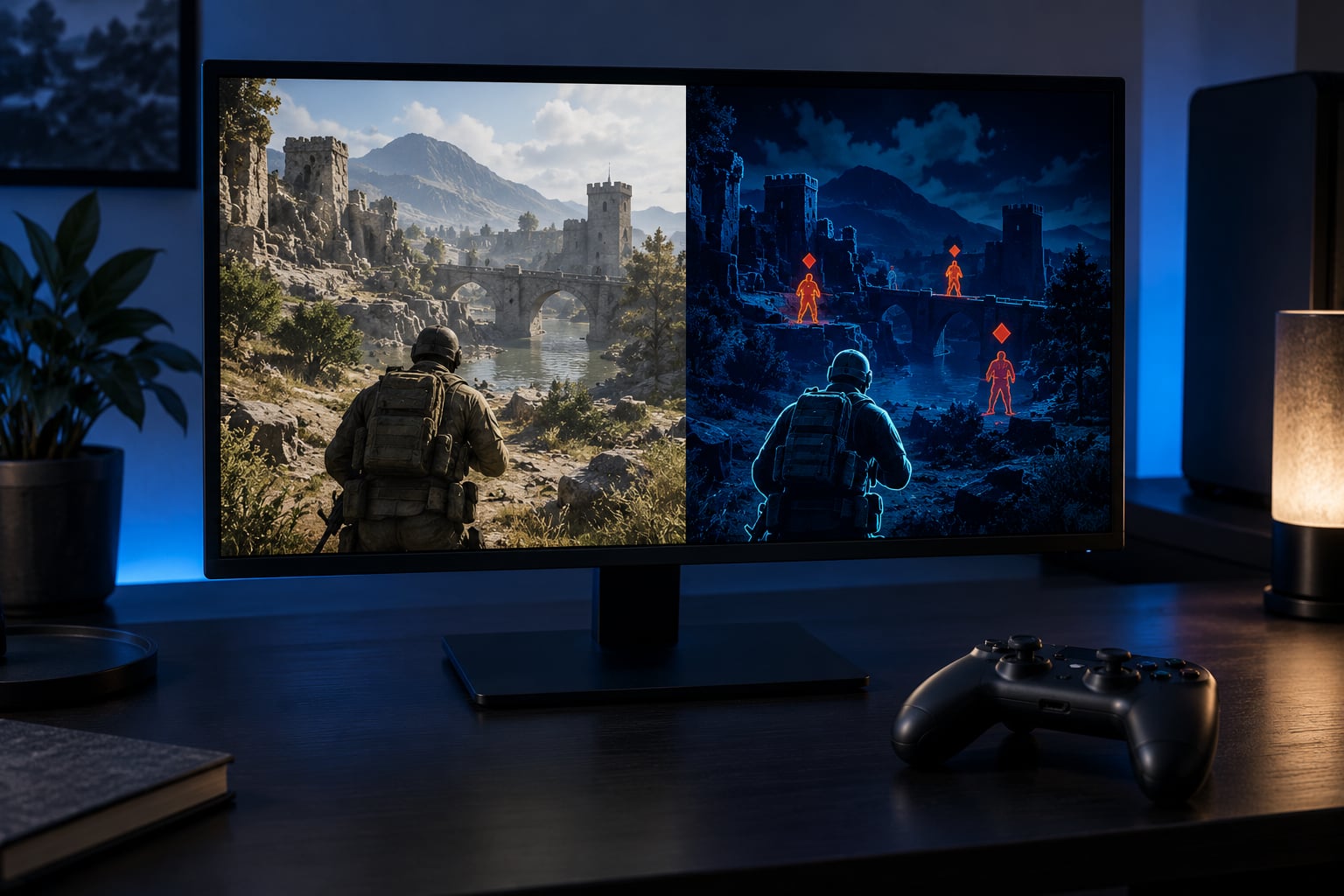
- Interface rebuild. The mode adds a second channel that has nothing to do with color: icons, patterns, outline thickness, text labels, or audio cues. This is the most work and the only approach that actually fixes red-versus-green signalling.
Historically, designers prototyped this in Photoshop with Proof Setup color blindness proofs, simulating a scene before any engine work existed. The Sim City team later applied color transforms to the game’s color lookup tables, which is the same idea applied to shipped art.
Answering the related question directly: a colorblind filter shifts colors on screen; a colorblind mode is whatever the developer bundled that with. Games that only ship the filter are doing the minimum.
What Each Type of Colorblind Mode Changes
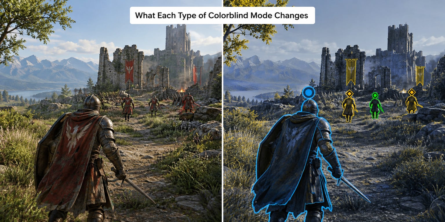
Every preset removes one cone type from the simulation, so each produces a different collapse. Here is what each one does in plain terms.
| Mode | What it simulates | What it does to colors |
|---|---|---|
| Protanopia | No red-sensitive cones | Reds shift toward dark yellow, brown, or near-black |
| Deuteranopia | No green-sensitive cones | Red and green collapse toward yellow and beige; the most common form |
| Tritanopia | No blue-sensitive cones | Blue and yellow swap roles; rarer and often left out of games |
| Achromatopsia simulation | Almost no color discrimination | Collapses to luminance only, the same as a grayscale test |
| Monochrome filter | Optional, not a deficiency | Removes hue entirely so every signal must survive on brightness |
A protanopia filter pulling red toward dark is why red stop signs and blood effects can look nearly black. A deuteranopia filter turning red and green into similar yellows is exactly why red-versus-green enemy coding collapses. Tritanopia messes with blue and yellow instead, which is why players with it often report a problem with the sky or water rather than with health bars.
Monochrome deserves separate mention because players use it as a diagnostic, not a preference. If a game is still playable with every hue removed, it never depended on color alone.
Why Games Combine Color Filters With Extra Cues
Filters work best as one layer in a stack, never as the whole answer. The techniques that hold up in practice are the ones that add a second channel.
- Icons. A shield glyph instead of a colored bar. This is the pattern players on r/ColorBlind ask for most often, and the one that works for everyone whether or not they turn a setting on.
- Shape and silhouette. Bejeweled’s gems differ by shape, not just hue. Playing-card suits work the same way.
- Outlines and thickness. Enemy outlines that change width or style are readable against any background.
- Luminance tiering. Assigning four brightness levels to four categories means the signal survives even if every hue collapses.
- Patterns. Dots, stripes, or grids on loot tiers, as used in older shooter interfaces.
- Audio. A distinct sound for a teammate marker, which costs nothing visually and survives any filter.
League of Legends is the example players on r/leagueoflegends point to most often, and the reason is specific: its mode restructures health bars rather than tinting the world. Yours, allies, and enemies get separated by structure instead of relying on a hue shift. That is the difference between a mode that gets criticized and one that gets used.
How to Find and Test Colorblind Settings in a Game
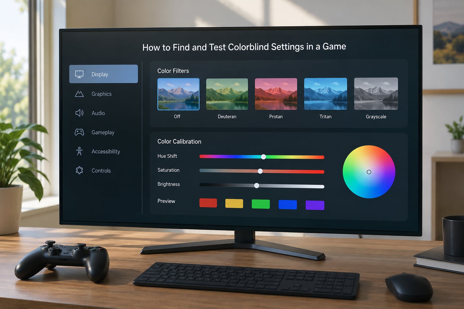
Menu paths change between games, devices, and app versions, so treat these as starting points rather than exact instructions. Check the following in order.
- In-game accessibility menu. Look for Accessibility, Display, or Video settings, then search for colorblind, color correction, or daltonization. Many games bury it under Graphics or Display rather than accessibility.
- Console-level filters. On Xbox, check Settings, then Ease of Access. On PlayStation 5, check Settings, then Accessibility, where protanopia, deuteranopia, and tritanopia corrections are offered system-wide. Nintendo Switch has accessibility options in its system settings, though coverage varies by game.
- Mobile display filters. iOS Accessibility settings include display filters, and Android offers color correction options in accessibility menus. These apply system-wide and stack with a game’s own mode, which can over-correct.
- In-menu calibration. Some games include Ishihara-style test plates in the settings screen so you can compare presets. Fortnite runs this pattern, with a strength slider running from 0 to 10 in small increments, giving a much finer choice than an on-off toggle.
Then play ten minutes, not two. Stand up and check whether your monitor has a screen filter or a night mode overlay that is shifting the whole scene; that is a frequent reason a mode looks wrong.
How to Choose the Best Colorblind Mode for Your Needs
Deuteranopia is the most common form, so it is a reasonable first guess, but guessing is exactly what players do badly. Pick by testing rather than by diagnosis.
Run each preset against something you know the color of. Grass should look like grass. Skin tones should look human. If a preset makes the world look like a sunset, it is probably simulating a deficiency you do not have.
Then check the things you will actually rely on:
- Brightness and contrast. Raise game brightness first, then contrast. A mode that works at default gamma often falls apart in a bright room.
- HUD readability. Health, ammo, cooldowns, and objective markers should be readable without squinting.
- Enemy visibility. Check a busy scene, not an empty one. Outlines that work against a plain sky can vanish against foliage.
- Subtitles and text. Some filters lower contrast on light text. If subtitles fade, adjust or switch presets.
- Environmental effects. Fog, bloom, and heat haze can erase the outline the mode depends on. Turn them down if visibility suffers.
One more test that catches a lot: take a screenshot and look at it in grayscale on any device. If you cannot tell teammates from enemies, the mode is tinting rather than restructuring.
Common Problems and How to Fix Them
Everything looks washed out. A filter maps colors into a narrower range, which flattens contrast. Raise the in-game contrast slider before touching the preset, and drop the brightness a notch.
Text and subtitles are harder to read. The mode is pulling light text toward the background. Increase text outline thickness where the game offers it, or pick a preset that leaves luminance alone.
Effects are too bright. Bloom and particle flashes survive filters because they are near-white. Lower the effect intensity slider, which usually sits in the display or graphics menu.
HUD icons disappear. Some modes recolor the world without touching the interface, or vice versa. This is a limitation of the implementation, not your settings. Check whether the game has a separate high-contrast option.
Enemies still blend in. No palette swap fixes a scene where the entire environment is one hue. Look for outline thickness, silhouette, or audio marker options instead, and if the game has none, that title is not going to work for you regardless of preset.
The mode vanishes in your main mode of play. Online multiplayer and ranked queues sometimes launch with their own settings. Check the loadout or lobby settings rather than the main options screen.
The game has no colorblind mode at all. Turn to your platform’s system-wide filter first. It will not fix interface design, but it can help with world colors. Beyond that, look for a community patch, a shader mod, or simply check the game’s settings on a newer patch, because accessibility support does get added years after launch.
Frequently Asked Questions
What is the best colorblind mode for most games?
Deuteranopia is the most common form of color vision deficiency, so it is the sensible starting preset for most players. Treat it as a starting point rather than a diagnosis. Switch presets until familiar surfaces such as grass, skin, and sky look natural, then check that health bars, enemy outlines, and loot tiers are readable in a busy scene.
Can colorblind settings make any game fully accessible?
No. A filter only shifts colors, so any information the game encodes in hue alone stays broken or becomes differently broken. Full playability needs a second channel such as icons, outlines, shapes, patterns, or audio markers. Games that add those redundancy cues become genuinely playable; filter-only modes usually just shift the problem.
Why can I still see enemies poorly after enabling colorblind mode?
Most often because the mode recolors the world without touching enemy outlines, minimap colors, or silhouette cues. Another common cause is a busy environment where one hue fills the whole scene, which no palette swap can fix. Try raising contrast, lowering bloom and fog, and switching presets. If outlines remain the only differentiator, the game itself lacks redundancy.
Do colorblind modes change gameplay or difficulty?
A well-built mode does not. It changes how information is presented, not how the game calculates outcomes, and it does not add markers or sound cues that non-colorblind players lack, so it should not confer a competitive advantage. A crude tint-only mode can make a title harder to read for some players, which is why in-game calibration plates and strength sliders are worth using.
What should I do if a game has no colorblind options?
Start with your platform’s system-wide filter, such as display filters on iOS or color correction in Android accessibility settings, then adjust the game’s own brightness and contrast. If that is not enough, look for community shader mods or accessibility mods on PC. On console, check the game’s settings again after major updates, since support is sometimes added late.
What Should You Do First?
Pick the preset closest to your deficiency, usually deuteranopia. Turn brightness up and contrast up until the HUD is comfortable. Then turn on every extra cue the game offers, outlines, icons, thickness settings, and any high-contrast option. Test in a bright room and a dark one before you settle.
If a filter leaves you still squinting, that is a design limitation rather than your eyesight. The right answer is a different game or a mod, not another slider. Updated for 2026.